
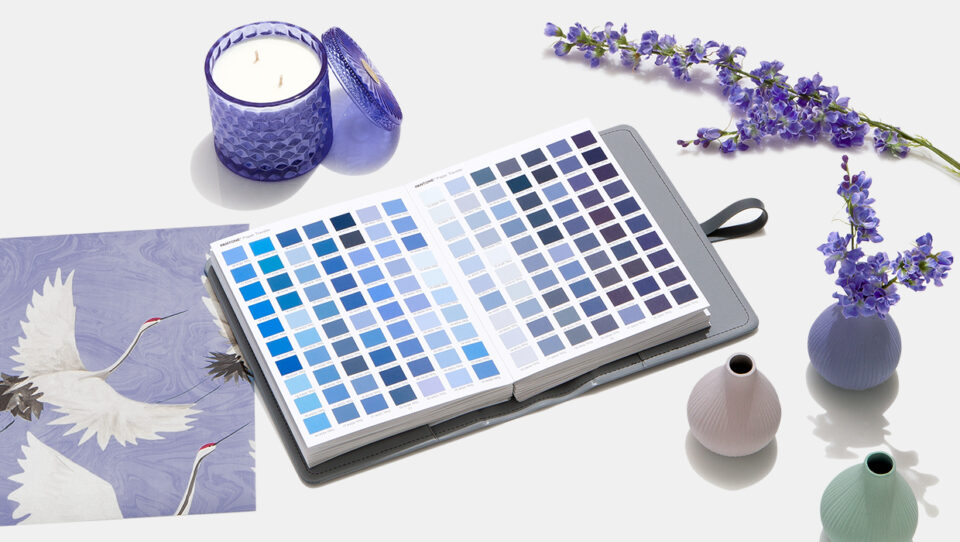
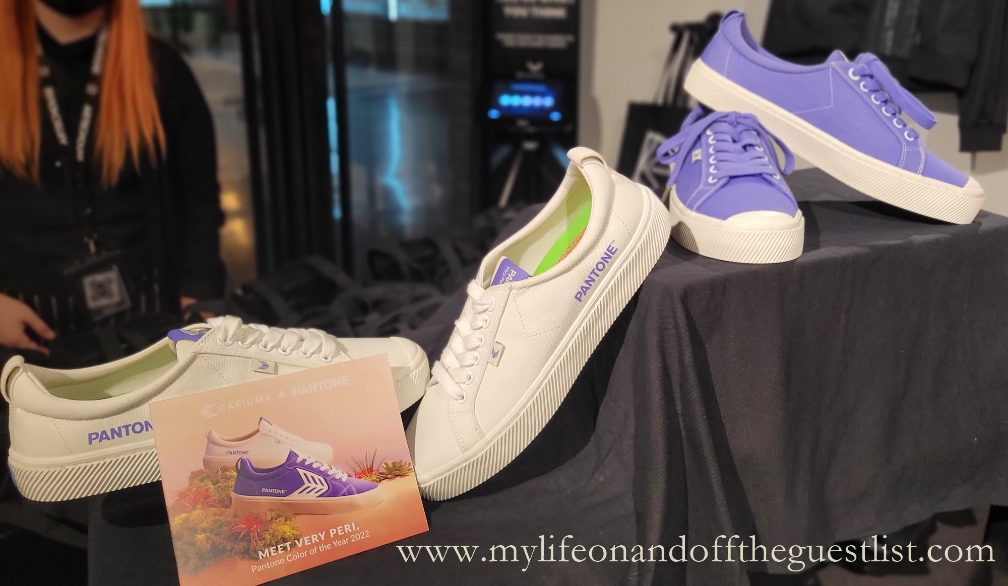
Every year, Pantone provides a color that is meant to symbolize and inspire the entire year. Each year, the color changes to reflect what hues are going to be influential in the coming months and how you can use them to influence the outcome of your year. This year, the Pantone Color of the Year is Very Peri. This is a delightful, dusty color that is a mix of purple and blue. A fun, happy, and thoughtful color overall, it is suitable for a wide range of applications. Whether you’re looking for the right shade to re-do your bathroom or bedroom in or you want a new color for a signature eyeshadow looks, this could be it.

What Is Very Peri?
As you may have guessed, Very Peri is a version of periwinkle. Periwinkle is known to be a courageous color that encourages those who see it and wear it in fashion to be inventive and creative.
The color periwinkle means friendship, womanhood, and support. It is a positive color that is going to help you be more hopeful, upbeat, and happy in 2022. It is also a pure color that is going to give off a lovely aura, no matter how you use it. Made of blues and purples, this color can be great if you want a hue that is soothing and calming.
Every color has meanings associated with it. When you’re painting a room, blue will be used to create a calm atmosphere, yellow to create a lively one, and white to create a neutral one. In the floral world, red carnations symbolize deep love, white represents pure love, and yellow represents dejection. Color can say a thousand words and the color Very Peri embodies ease and joy. This is a great color if you want to spruce up your home, wardrobe, or style. With Very Peri, you can easily add a pop of color that is going to both entertain and soothe.
Keep Up with the Times with Pantone
The times have certainly changed. Decades of the past have seen popular colors and palettes come and go, whether you’re looking at the neutrals of the 1940s or the warm earth tones of the 1960s and 1970s. Those decades have seen societal and legal changes as well, such as how in 1962, 11.5% of civil cases went to trial while today, the number of federal cases that make it to trial is estimated at around 1%. While the times change in almost every way, you can rely on Pantone to set the standard for the year with their color of choice.
Pantone started doing the color of the year in 2000 and has since put forth some gorgeous colors that have helped many people set the mood for their entire year. Even if you’re among the portion of the population that is colorblind, such as the 8% of men with Northern European ancestry who are color blind and the 0.5% of women who are, you can still use the Pantone color of the year to get a read on the trends for the upcoming year. With Very Peri, you can expect to see pastels coming to the forefront as the palette of choice.
Each year, the Pantone color of the year may seem a bit bolder than some of your average colors. Though they may seem bold, they do have the ability to help you get some great color inspiration for your personal spaces. Pantone is a wonderful company that does what it can to help inspire people. Pantone colors are gorgeous and can make either a small impact or a large impact on your personal style if you decide to add them to your home design, clothing choices, or anywhere else in your life.